

| Eska (R) Workflow Controls |
   |
· Choose one of the above controls (labels , text box, .. etc );
· Create your own Design ;
·
Click on .
.
To build a form and specify its details, you need to click on the hyperlinked name of the needed form and then proceed with the following steps:
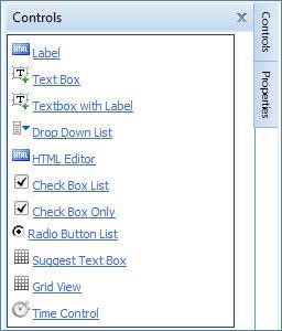
Click  to view the Controls
that assist you in building your form and performing any necessary alterations:
to view the Controls
that assist you in building your form and performing any necessary alterations:
· The Label allows you to write names of fields;
· The Text Box allows you to permit users to place their inputs;
· The Text Box with Label allows you to add a textbox that will represent the field with a label;
· The Drop-down List allows you to add a list of options from which the user can select one;
· The HTML editor allows you to edit information on HTML format;
· The Check Box list allows you to insert a list box in the form;
· The Check Box Only allows you to insert a check box in the form;
· The Radio Button list allows you to insert a radio button in the form;
· The Suggest Text Box allows you to add a suggest textbox ;
· The Grid View allows you to add a grid view;
· The Time Control allows you to add a time control;
Click  to view the Properties
that assist you in building your form and performing any necessary alterations:
to view the Properties
that assist you in building your form and performing any necessary alterations:
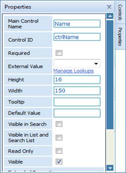
· Enter the Control’s ID;
· Check in Required checkbox if you want to make this field a mandatory field;
· Select the External Value from the dropdown list; which contains different properties were the selected property will automatically be loaded when the user runs the form.
Example: If the user selects the employee
name, the system will automatically fill in the textbox with the logged in employee
name.
· Enter the control’s Width and Height to specify its exact size;
· Enter the Tooltip, which is used in conjunction with a Cursor. The user hovers the cursor over an item, without clicking it, and a tooltip may appear with a small "box" that contain information about the item being hovered over
· Enter the Default Value, which is used to enter a default value that will appear in the text box
·
Check in
the following checkboxes of you want to imply them on the selected field: Visible
in Search, Visible in List and Search List,
Read Only: check this checkbox if you want to make this field a read
only field
Visible: check this checkbox if you want to make this field visible to the user
· Enter the Control’s Maximum Length; The field is used to set the text box to maximum length
· Select Text Mode: select the design of the text box (single line or multiline)
· Select the Validation Type, to select the data type that the textbox will take;
Related Topics
| |